Rocking The Responsive Web
One Site. Every User. Every Device.
Who am I?
( Josh Broton! )

- Interactive Design Lead / Front-End Developer at VistaComm in Sioux Falls, SD
- Freelance: Design, front-end development, UX audits
- Front-end developer for KidBlog.org
- Largest educational blog system in the world
-
3rd largest WP Multisite install in the world
(unconfirmed)Largest WP MultiSite with single db in the world
Who am I?
( Josh Broton! )

- Computer & Network Security / Computer Science at DSU
- joshbroton.com
- twitter.com/joshbroton


Responsive == ?
- A flexible, grid-based layout
- Flexible images and media
- Media queries used to determine layout

http://www.alistapart.com/articles/responsive-web-design/
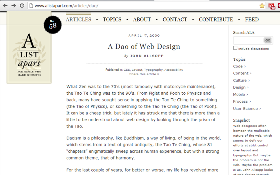
http://www.alistapart.com/articles/dao/
Why RWD?
The control which designers know in the print medium, and often desire in the web medium, is simply a function of the limitation of the printed page. We should embrace the fact that the web doesn't have the same constraints, and design for this flexibility. But first, we must 'accept the ebb and flow of things.'
-John Allsopp in "A Dao of Web Design"
Why Do Responsive?
What does he mean by "the ebb and flow of things?"Better question: What do we see that is changing the way people use the web?
Even better question: What is changing the way you use the web?
Why Do Responsive?

How do you access the Internet?
Some Stats
- 55%: US Adults that access the web via mobile devices
- 31%: US Adults whose primary browsing device is mobile
- 2013: The year mobile phones will overtake PCs as the most common Web access devices
Desktop vs. Mobile

Desktop-only sites need to die.
Desktop vs. Mobile
- 480 million: Android devices activated
- 400 million: iOS devices activated
- 1 billion: Total Windows machines as of June 2012
More Stats
- 1,038,000,000: smartphones IN USE. (10/16).
- Q3 2012: When smartphones shipments surpassed PC shipments
- 600%: Growth in mobile web traffic since 2010

|
It's
|
UX IS
KING
Impact?
- 61% leave a site if it isn't mobile-ready
- 79% search for another site
- 50% look outside an established relationship
- 48% said if a site didn't work on a mobile device, they didn't feel the company valued their business
Native vs. Mobile
2.5/month vs. 24/day
(user app downloads vs. user site visits)
source: zeldman.com
source: zeldman.com
"But my users..."
11% -> 22%: WVU's mobile traffic doubled within one month.Staggering Change

Making the Web Responsive

Flexible Grids
-
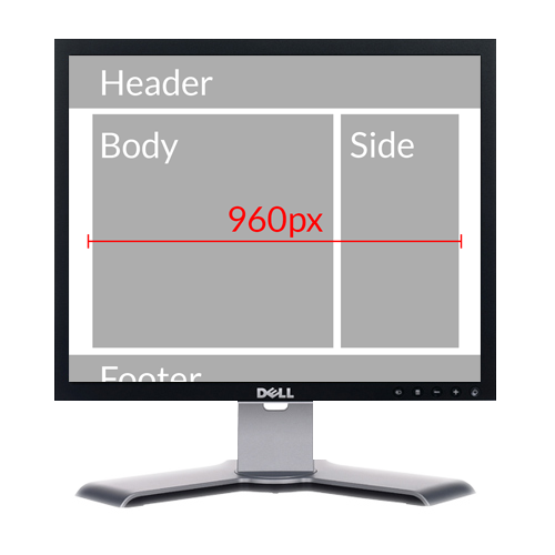
Grid systems are used to create uniform space allocation.
- 960px = standard
- 960 Grid System, etc
960 Grid System
.grid_1 { width:60px; }
.grid_2 { width:140px; }
.grid_3 { width:220px; }
.grid_4 { width:300px; }
.grid_5 { width:380px; }
.grid_6 { width:460px; }
.grid_7 { width:540px; }
.grid_8 { width:620px; }
.grid_9 { width:700px; }
.grid_10 { width:780px; }
.grid_11 { width:860px; }
.grid_12 { width:940px; }
960 grid system

One problem: Not flexible!
960px used to be fine
But then this happened...


And
then
this:

Things You Can Do
Now*
Flexible Grids
Pixels are out. Percents are in.


100% Grid System in Sass
.one { width:8.3333333333%; }
.two { width:16.6666666667% }
.three { width:25%; }
.four { width:33.3333333333%; }
.five { width:41.6666666667%; }
.six { width:50%; }
.seven { width:58.3333333333%; }
.eight { width:66.6666666667%; }
.nine { width:75%; }
.ten { width:83.333333333%; }
.eleven { width:91.666666667%; }
.twelve { width:100%; }
Media Queries
- Different layouts for different screens
- Device agnostic
Media Queries
/* CSS FOR ALL DEVICES GOES HERE */
@media only screen and (min-width: 30em) {
    /* CSS FOR SCREENS WIDER THAN ~480PX GOES HERE */
}
@media only screen and (min-width: 37em) {
    /* CSS FOR SCREENS WIDER THAN ~600PX GOES HERE */
}
@media only screen and (min-width: 48em) {
    /* CSS FOR SCREENS WIDER THAN ~768PX GOES HERE */
}
@media only screen and (min-width: 56em) {
    /* CSS FOR SCREENS WIDER THAN ~992PX GOES HERE */
}
@media only screen and (min-width: 82em) {
    /* CSS FOR SCREENS WIDER THAN ~1382PX GOES HERE */
}
Viewport Meta
<meta name="viewport" content="initial-scale=1.0,width=device-width" />- "initial-scale=1.0" sets zoom to 100%
- "width=device-width" sets viewport to device size
Other Meta tags
<meta name="MobileOptimized" content="320">
<meta name="HandheldFriendly" content="True">In .htaccess file:
BrowserMatch MSIE ie
Header set X-UA-Compatible "IE=Edge,chrome=1" env=ie
JS Polyfills
<!--[if (lt IE 9) & (!IEMobile)]>
    <script src="/scripts/selectivizr.min.js">
    <script src="/scripts/imgsizer.js">
    <script src="/scripts/respond.min.js">
<![endif]-->Your Best Friend
<script src="/scripts/modernizr.min.js">Modernizr
Modernizr.load({
    test: Modernizr.cssgradients,
    yep : 'geo.js',
    nope: 'geo-polyfill.js'
});Two More Things!
- HTML5 Shiv
- Classes on <html> listing supported/unsupported features

(you should be using Modernizr, even if you're not making responsive sites)
Is
It
Magic?

Things You Can Do
Soon*
CSS3 Flex Box
2009 Syntaxsection {
display:box;
box-orient:horizontal;
}CSS3 Flex Box
Weird, In-Between Syntaxsection {
display:flexbox;
flex();
}CSS3 Flex Box
Correct Formatsection {
display:flex;
box-orient:horizontal;
}
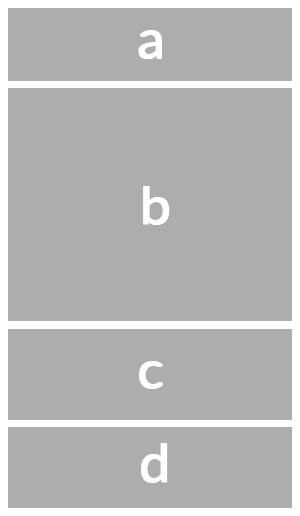
CSS3 Template
body {
    display: 'a'
             'b'
             'c'
             'd';
}
CSS3 Template
body {
    display: 'a a a'
             'b b c'
             'd d d';
}
CSS3 Grid Layout Template
body {
    display: 'a a a a a a a a a a a a'
             'b b b b b b b b c c c c'
             'd d d d d d d d d d d d';
}
RESS
- "Responsive Development + Server Side Components"
- Serving different images and media to different devices
Responsive Images
img srcset
<img alt="The Breakfast Combo"
    src="banner.jpeg"
    srcset="banner-HD.jpeg 2x,
	banner-phone.jpeg 100w,
	 banner-phone-HD.jpeg 100w 2x">
Responsive Images
Picture Element
<picture alt="Description of image subject.">
    <source srcset="small.jpg 1x, small-highres.jpg 2x">
    <source media="(min-width: 768px)"
            srcset="med.jpg 1x, med-highres.jpg 2x">
    <source media="(min-width: 1382px)"
            srcset="large.jpg 1x, large-highres.jpg 2x">
    <img src="small.jpg" alt="Description of image subject.">
</picture>
Are responsive images available now?
<script src="picturefill.js" type="text/javascript"></script>
<div data-picture data-alt="A giant stone face at The Bayon temple">
    <div data-src="small.jpg"></div>
    <div data-src="medium.jpg"
         data-media="(min-width: 400px)"></div>
    <div data-src="large.jpg"
         data-media="(min-width: 800px)"></div>
    <div data-src="extralarge.jpg"
         data-media="(min-width: 1000px)"></div>
    <!-- Fallback content for non-JS browsers. -->
    <noscript>
        <img src="external/imgs/small.jpg" alt="A giant stone face">
    </noscript>
</div>
Media Queries in JS
if (window.matchMedia("(min-width: 400px)").matches) {
	/* the view port is at least 400 pixels wide */
} else {
	/* the view port is less than 400 pixels wide */
}
tl;dr
People want mobile-friendly sites now, not two years from now. Responsive design is ready. Do it now.THANK YOU!
Questions?
twitter.com/joshbroton
joshbroton.com